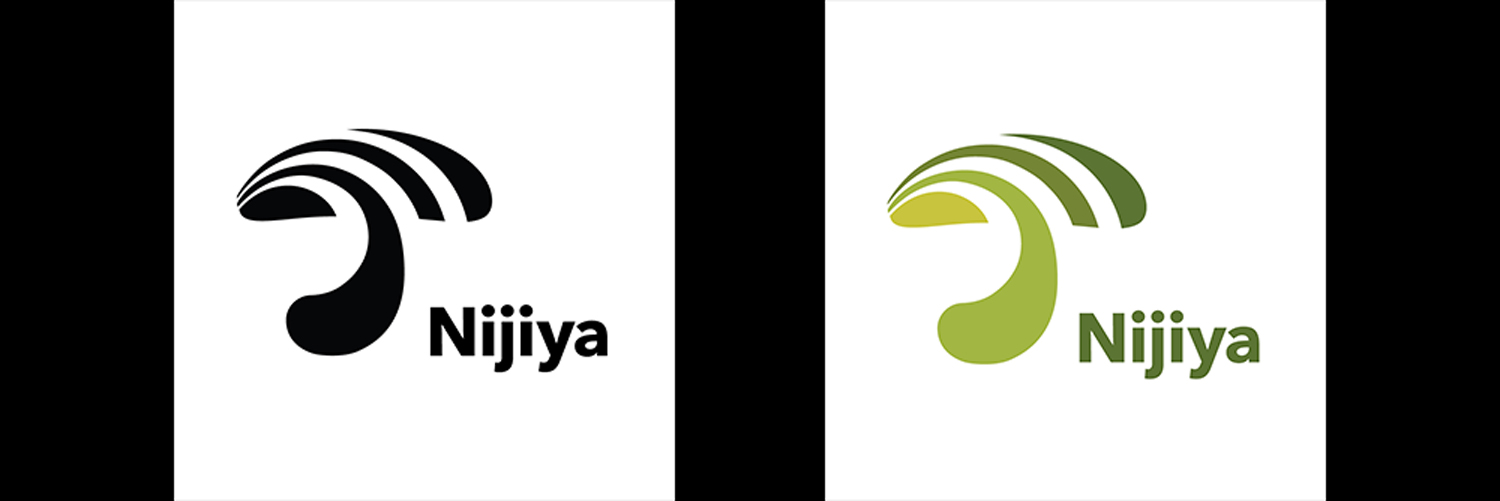
Corporate Logo Design
A unique new symbol for Nijiya Market
Through this assignment, we learned how to create functional graphic symbols or logos to communicate the intended message based on research. Also, we learned that functional designs are distinctive, appropriate, timeless, practical, and simple.
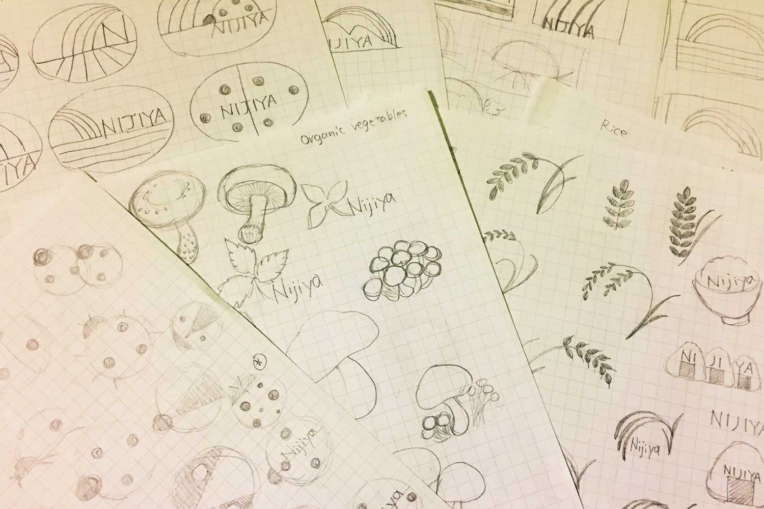
Exploring Designs
Nijiya Market is known for a Japanese supermarket that provides fresh and organic food. Even though I often go there, when I tried to remember the Nijiya logo, the color scheme immediately came to mind, and however, I couldn't remember the design. In this project, I tried to create a design that is easy for everyone to remember and recognizable.
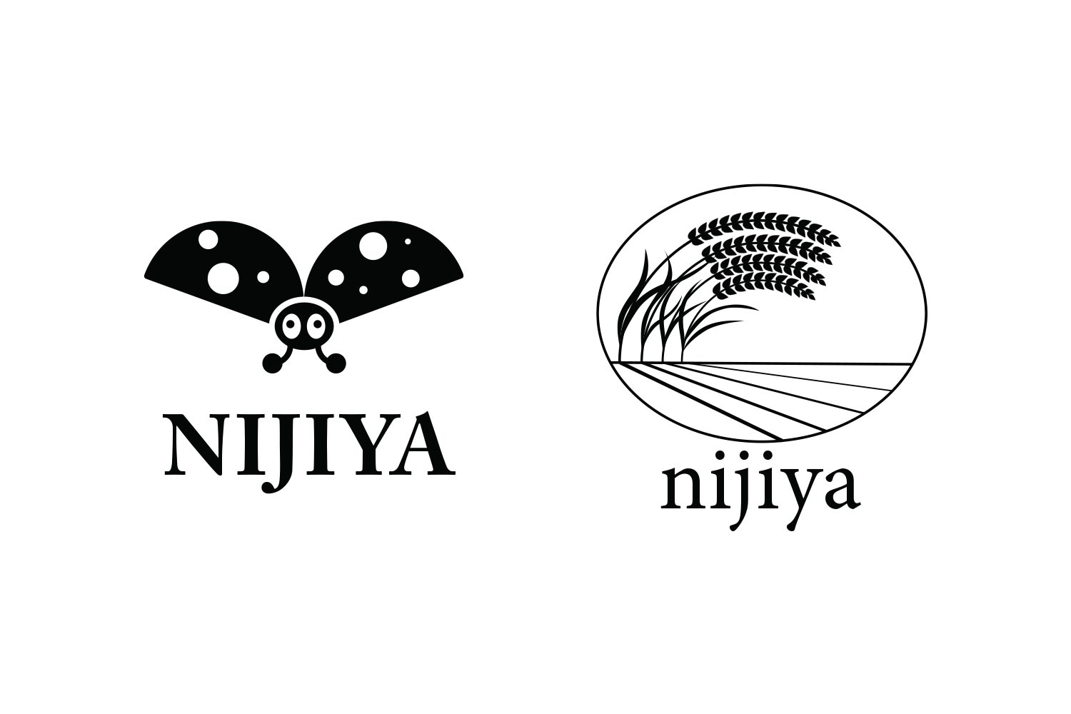
Proposal Designs
Nijiya uses ladybugs to pest control instead of using agriculture chemicals for their fields. I wanted to create a memorable and friendly-looking icon for Nijiya, and I decided to choose ladybugs for the first idea. My second idea was the ear of rice. I tried to create a delicate design to express like the atmosphere of Japan's idyllic rural scenery.
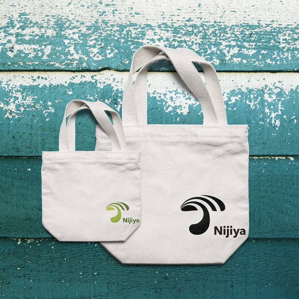
Final Logo Design
The third idea was shiitake mushrooms. When I went grocery shopping at Nijiya, I was surprised that there were organic and inorganic shiitake mushrooms. I thought shiitake mushroom was made in a specific environment using bacterias, and they grew by organic farming. I liked the curved shape of shiitake mushrooms, and I thought it is memorable and recognizable.
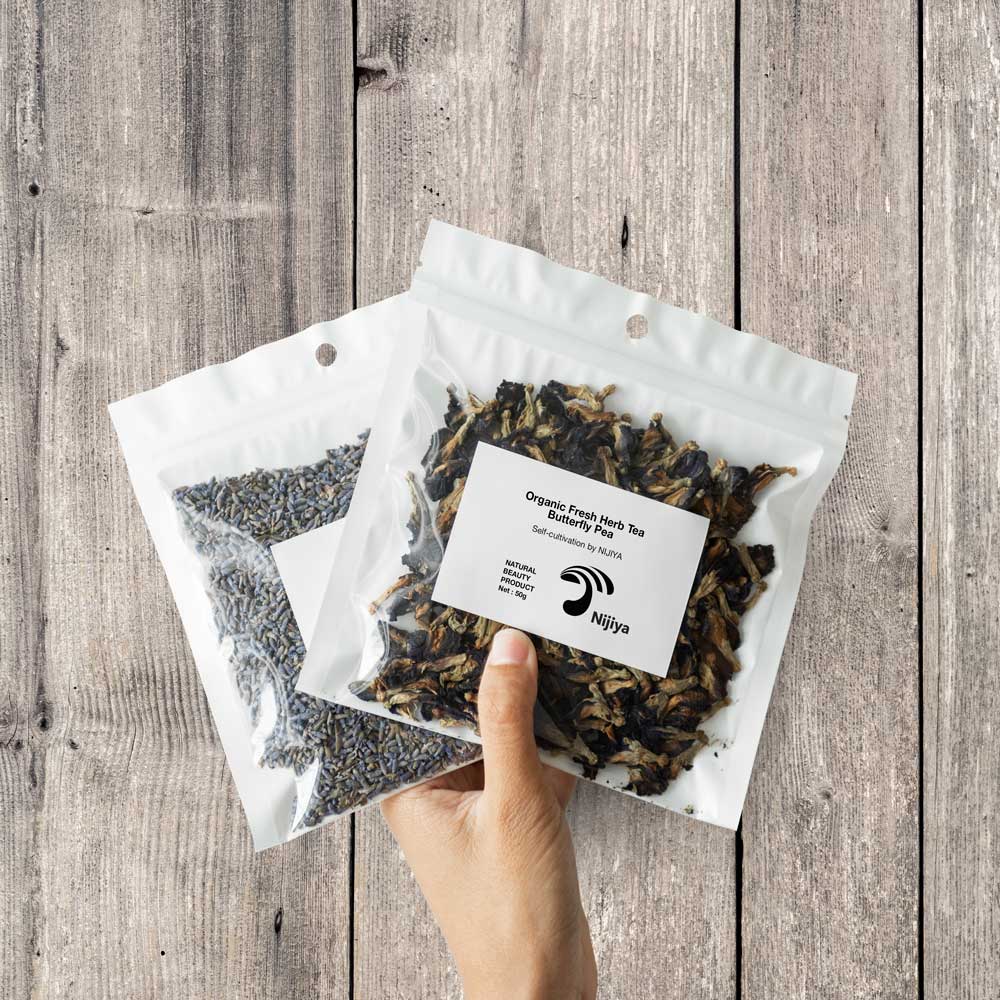
My Challenge
It was difficult for me to create an expected design with perfect curves without using outline strokes. The first design I submitted was using outline strokes. However, I wanted to further my design skill, and I kept seeking more polished design. Finally, I found appropriate curves for the Nijiya logo.