Palovia Package Designs
Logo Design and Brand Identity for a Skincare Line in Palestine
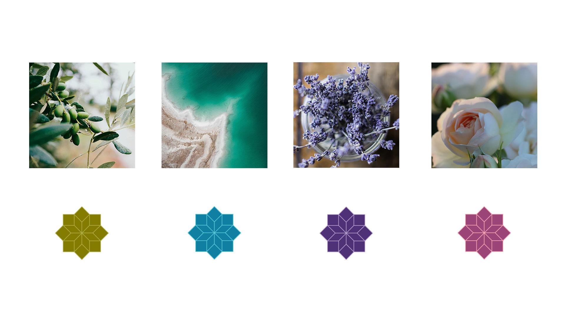
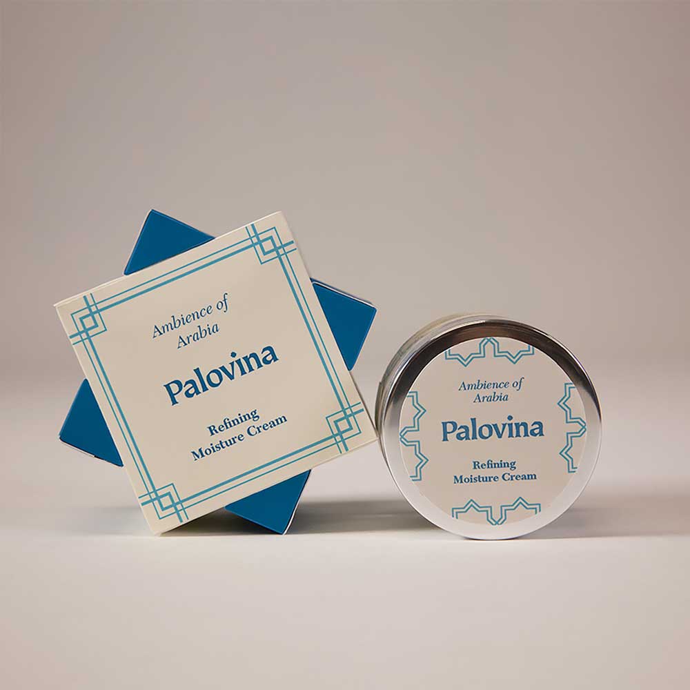
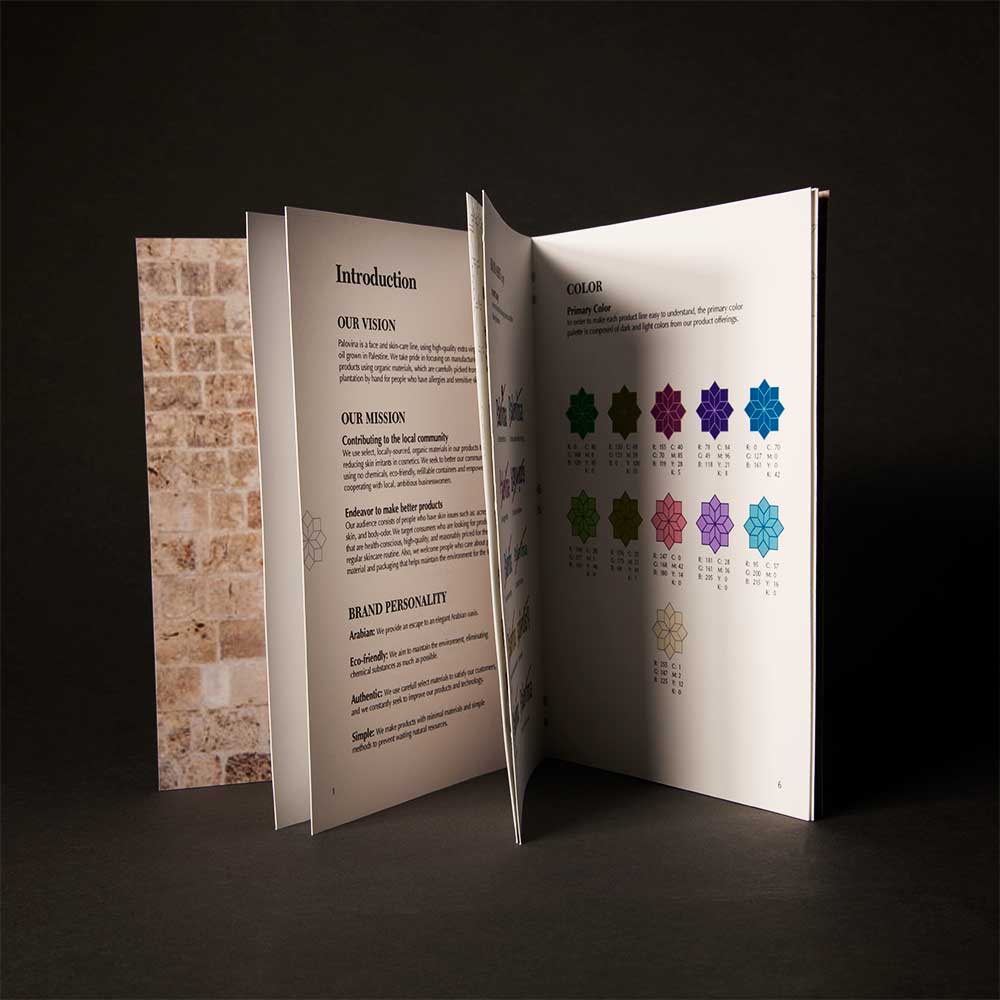
Palovina is a face and skincare line using high-quality olive oil from Palestine. I used Palestinian inspired type, imagery, and shapes to express the brand’s origins to its largely female audience.
Branding
In this branding project, I built a brand strategy based on detailed research, and I created a logo, packagings, and a website. I tried to create an elegant design that matches high-quality products, and I also considered eco-friendly and designs for the environment.
Go to Palovina website > Palovina Site
Sketching based on researches
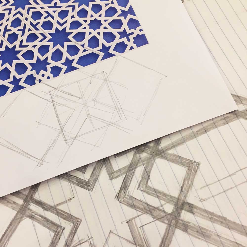
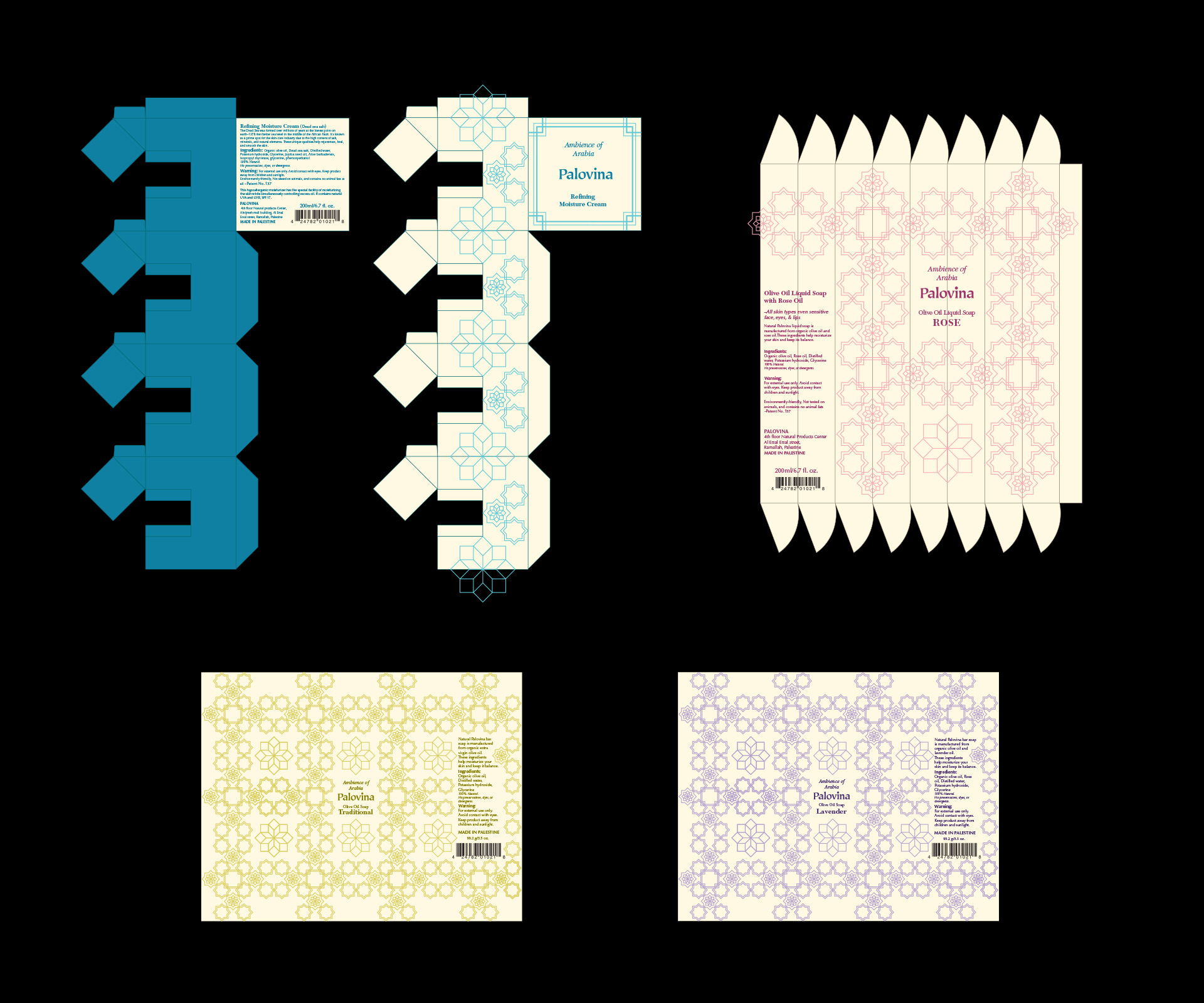
The first thing I noticed when I started researching was the Arabic pattern. The arabesque represents the universality, or god, which repeats geometric patterns and expands infinitely. I was also fascinated by its beauty and started by making my original Arabian patterns.
Prototypes
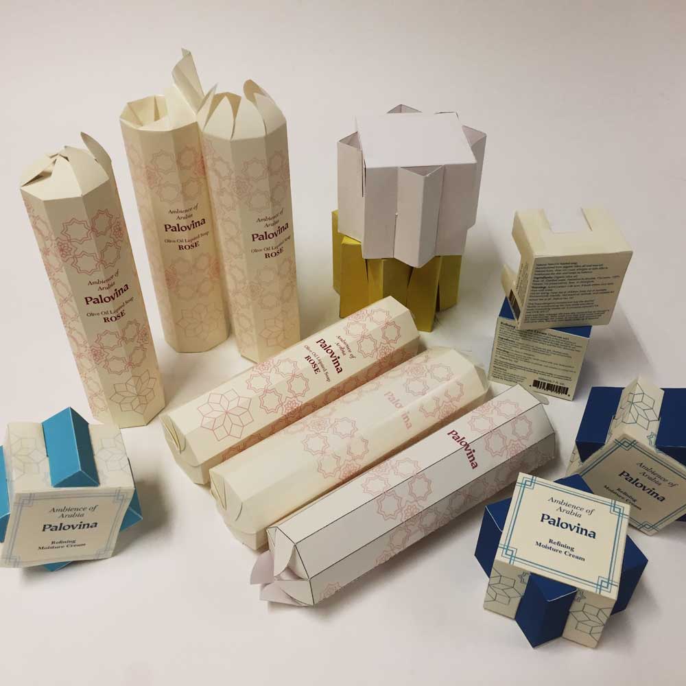
Next, I thought about the package design using my pattern. I wanted to create a new design by using the two squares that are the basis of my pattern, and I thoroughly investigated the design of the polygonal boxes. As a result, I decided to make a box in which squares were tilted 45 degrees and overlapped. At first glance, it seemed simple, and it seemed like it could be done soon. However, I failed over ten times by tiled and error several small things interacted with each other, such as the size of the box, the thickness of the paper, and paper material.
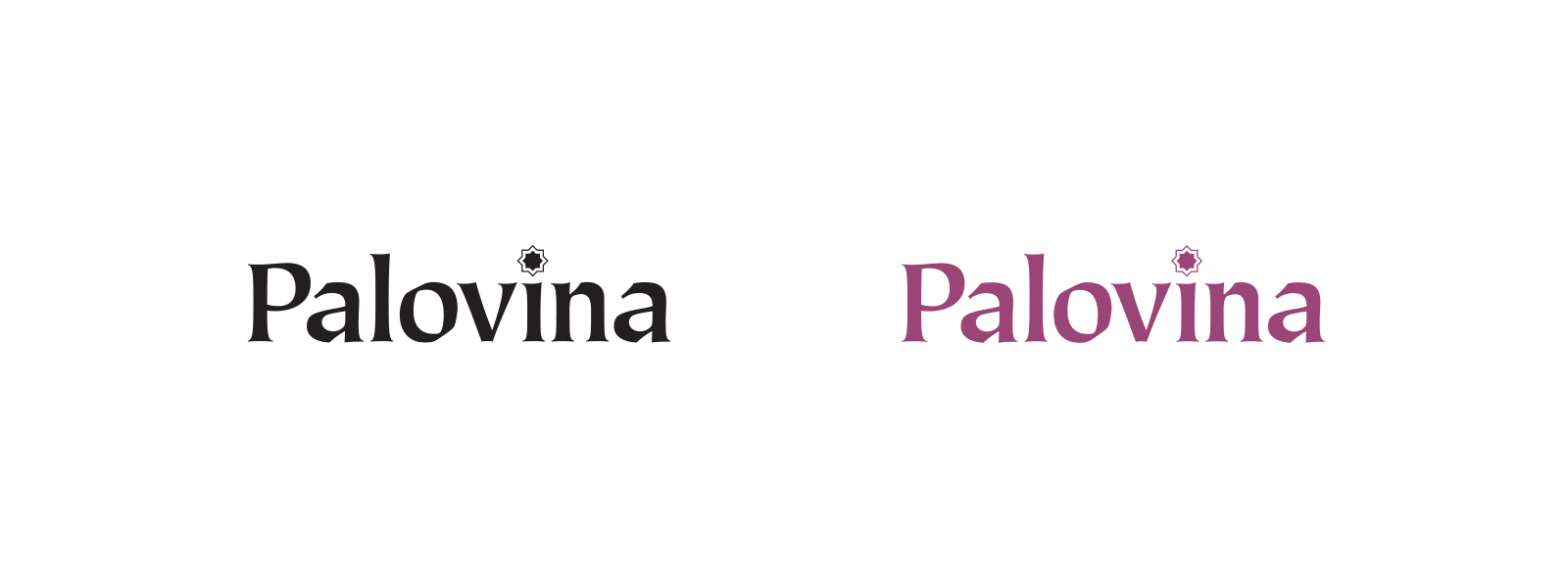
Main Logo Designs
Package Patterns
Color Pallet
